Common Tricks, But Not for Magic Purposes
A data visualization can be altered by tweaking some key parts to mislead and impress viewers far from reality. Here are some trick under their sleeves that deceivers commonly use.
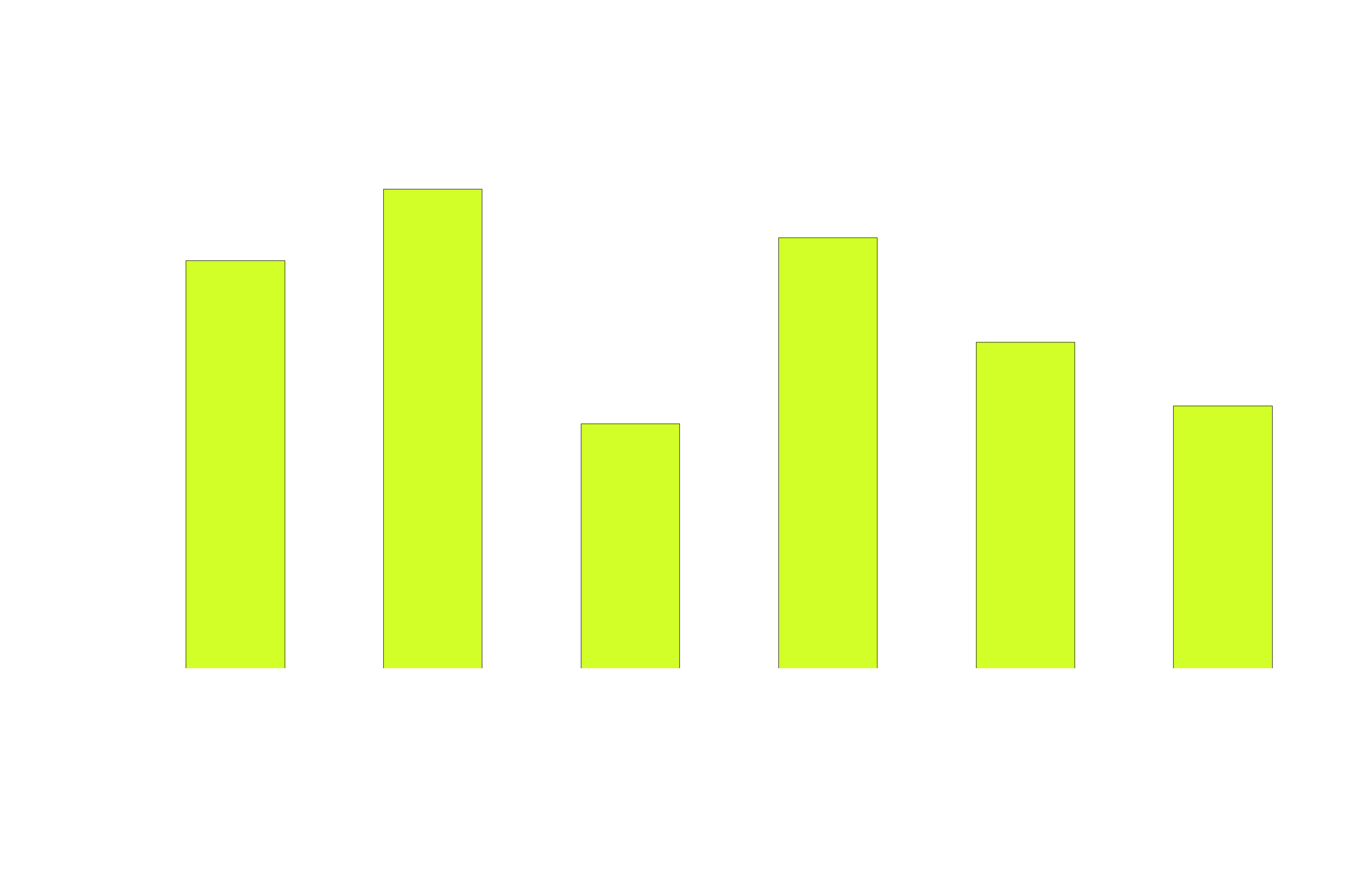
Scaling Manipulation
The data representation in a graph is altered by changing the scale of the graph. This allows flawed proportions in the graphs and misleads the viewer. Let's look at the following example.
Both graphs are created from the same data. However, the one on the left indicates that the average house price has increased substantially in a year. That is misleading as when we start the vertical scale at 10,000, the graph on right, the proportions of the graph are adjusted and we realize that’s not the case.
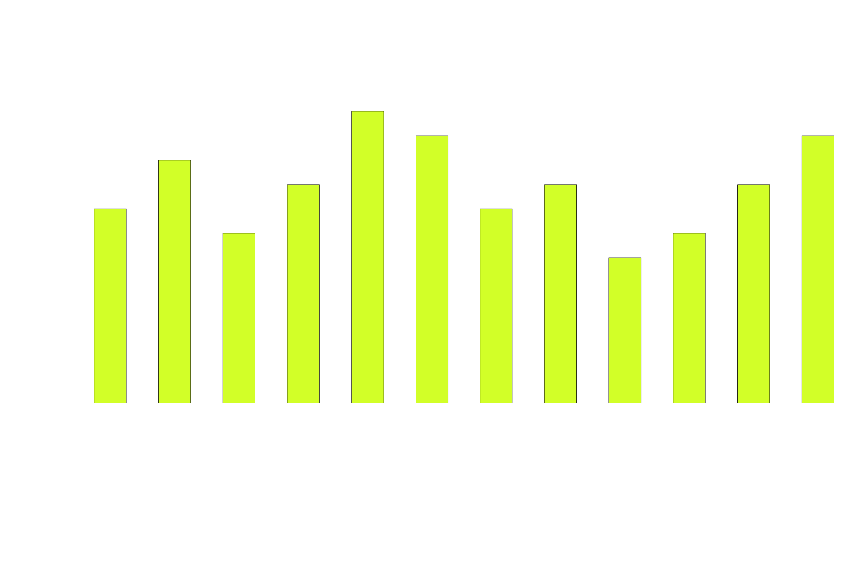
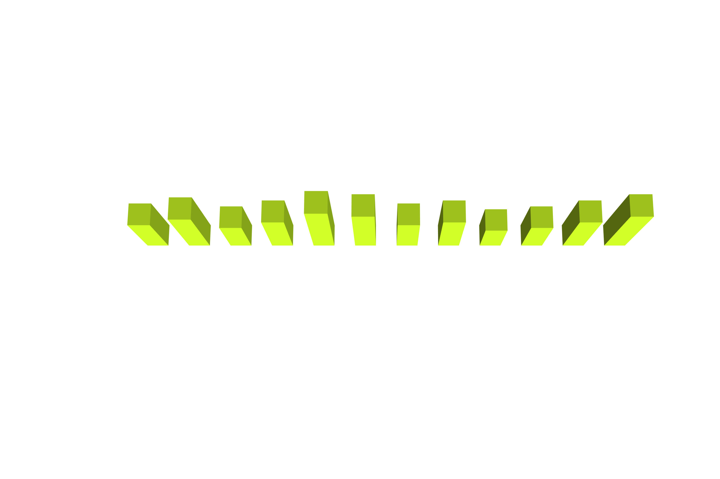
Three Dimensional Effects
When 3D effects are used in visuals, there is something seriously wrong. Three dimensional effects take into account change in distance, scaling and size to generate depth. Graphics using a 3D effect may be visually pleasing, however it is also very deceiving. Lets look at the example below.
With the three-dimensional effect, it looks like every country produces less than 10 metric tons of oranges, even though Australia, China, and Namibia produce more. The graph is actually manipulated by reducing differences between countries. We'd actually be better off drawing a 2D bar chart like the one on the right.
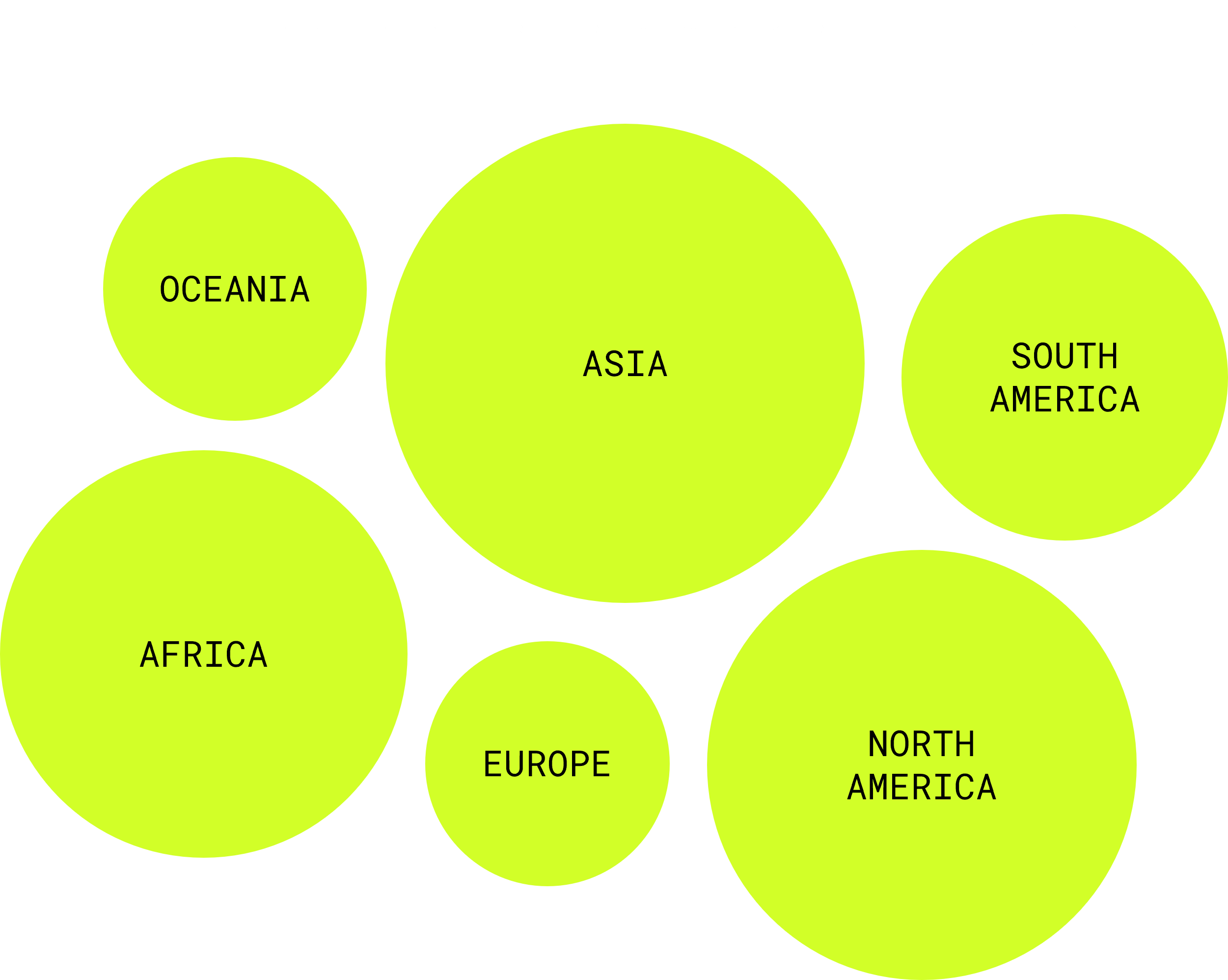
The Comparative Pictograph
Pictograph, as well as three-dimensional effects are trying to attract the attention of the viewer. They use cool shapes or pictures to show you data. However, most pictograph have the downfall of not sticking with the same shape, size, color, or any other design attribute. Thus, making very difficult for a person to actually differentiate between data categories. The example below uses circles size to show difference in number.
As you can notice, it is very difficult for someone to notice differences in diameter between the continent circles. One example would be to notice between North America's number of flu shots with the ones given in Africa. It is almost impossible, by just looking at the bubble pictograph to notice that North America gave out more flu shots than Africa, but not more than in Asia. That is why a bar graph would be a better option to show the same results, with a y-axis labeled with a scale.
Of course, people have more tricks under their sleeves to manipulate data visualizations.
But now you know ways to detect lies when you look at data visuals.
Sources used
Li, K. (n.d.). Introduction to Information Visualization. Retrieved November 20, 2021, from https://www.cs.princeton.edu/courses/archive/fall03/cs597F/Slides/info-vis-intro.pdf.
Tufte, E. R. (1983). The visual display of quantitative information. Graphics Press.
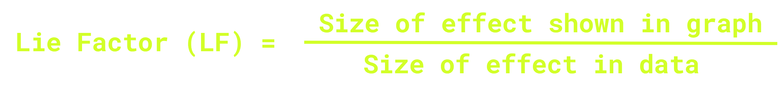
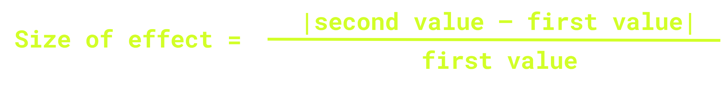
King, D., Aigner, W., & Solder, C. (2010, April 12). Lie Factor [Wiki]. Info Vis. https://infovis-wiki.net/wiki/Lie_Factor