The Good and the Bad Graphic
Data visualizations do not always communicate data in the way we hope.
No matter the fact that data visualization is one of the simplest forms to interpret data, it can also become the worst nightmare.
What makes a graphic to be bad one?
Anyone can create a graphic representation of data. However, for data visualization to convey what we intend to communicate, one must know how to generate simple eye-catching graphics.
That is why knowing what separates a good graphic from a bad one is so important.
Bad graphic visualizations are everywhere. You don't even need to look for them. It's easy to understand data via graphics because we are attracted to colors and patterns. There are many ways to ruin a graphic.
Sometimes, data visuals actually makes one be more confuse than without it.
So, what makes a bad graphic be bad?
The Good Ol' Lack of Information
One common reason data visuals become confusing and annoying is due to the lack of information. Sometimes happens by manipulation, other times by omitting important facts and data points essential for understanding.
Some examples are found on the buttons below.
Don't mess with Circles
There is something about circular visualization that makes them hard to read. It is hard to compare things that are not plotted into axes or grids. Also, the human eye get's constantly tricked into misinterpreting area sizes. One can only assume things when lack of metrics are present. For Data Visualization, that is not enough.
Look at the examples below to see some disgusting visuals.
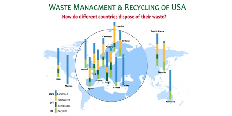
Too Busy for You
No, we are actually not too busy for you. However, some graphics can overload you if they look to busy. This happens when visuals contain too much information that it is so difficult to understand at first glance what is happening. It can also happen when too many colors and textures fill the graphic, making it hard to keep track of them.
Some examples of that can be found by clicking the buttons below.
Wrong Graphic
Happens to many times, that it has become a fad. Some people just are unaware that every Data Visualization has a specific purpose. Not all data will be able to be presented in a Bar Graph or a Pie Chart. So, that is why it is so important to choose the best graph to show the message you want to express to viewers.
Mishaps presented in the green buttons, again.
The Ten Commandments of Data Visualization
1 Understand your Data
2 Select the Right Data Visualization
3 Be as simple and basic as PSL
4 Present all the key data and information needed
5 Clean it up: no premade template fits perfectly
6 Use Design Features wisely
7 Avoid Circular Charts, especially Pie Charts
8 Verify Metrics and Scaling
9 Write a description and title
10 Write your Sources
Sources used
15 Bad Data Visualization Examples. (2021, February 3). Rigorous Themes. https://rigorousthemes.com/blog/bad-data-visualization-examples/
Junk Charts. (n.d.). Junk Charts. Retrieved November 30, 2021, from https://junkcharts.typepad.com/junk_charts/
When Data Visualization Really Isn’t Useful (and When It Is). (2021, May 11). Old Street Solutions. https://www.oldstreetsolutions.com/good-and-bad-data-visualization
Why You Shouldn’t Use Pie Charts In Your Dashboards And Performance Reports. (2021, July 2). Bernard Marr. https://bernardmarr.com/why-you-shouldnt-use-pie-charts-in-your-dashboards-and-performance-reports/
Bad Infographics: 11 Mistakes You Never Want to Make. (2016, February 3). https://visme.co/blog/bad-infographics/
Cool Infographics. (n.d.). Cool Infographics. Retrieved November 30, 2021, from https://coolinfographics.com
Ainsworth, Q. (n.d.). 5 examples of bad data visualization. The Jotform Blog. Retrieved November 30, 2021, from https://www.jotform.com/blog/bad-data-visualization/